INTERNET MARKETING NEWS
Standing out is the key brand challenge, so great brands play with their codes
I’ll tell you what, there has never been a more interesting time to study visual identity and packaging. In the last six months we’ve seen more bold moves by big brands than the previous decade. Barely a week passes these days without someone doing something to their logo, label, font or another of their brand codes.
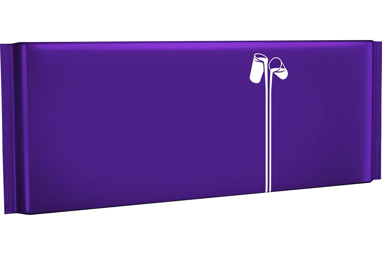
This week saw Cadbury remove wordage from its UK packaging to support Age UK and publicise the plight of the elderly. New research from Cadbury has revealed that 4.5 million people have felt lonely in later life. The ‘Donate Your Words’ campaign aims to draw attention to their plight by removing all wording from the packaging of a special-edition Dairy Milk bar and donating 30p to Age UK for each one sold.
Provided Cadbury sell around 120 million of the bars to make up for the £35m in taxes they legally minimised last year, and another 120 million for the millions of pounds they will almost certainly be legally not paying this year, I’m ready to rescind last week’s column and offer a full and forthright apology for ever doubting the company’s marvellous social conscience.
Cadbury’s brand purpose is just ‘woke-washing’
Purpose-wank aside, removing every single letter from your packaging is actually a very smart and very effective move. Because when companies play with well-established codes like this and remove or alter their appearance, the impact on salience and brand image is significantly improved.
Do you remember getting your wisdom teeth out? It’s an enduring memory for most people. The general panic at the operation, the excruciating hurt as the pain medication wore off and then that vacant canyon inside your mouth that felt about a foot wide.
I remember the odd realisation that I had become far more conscious of the size and location of my molars now that they had been removed than at any point in the 18 years they had sat in the middle of my head. Removing things makes you notice them again.
The impact of playing with codes
That’s how code play works too. When you fuck around with a properly distinctive asset like a logo or a colour or a shape, the market notices far more than if you stick to the brand management manual and a consistent look and feel. It’s a paradoxical effect but removing the word ‘Cadbury’ from a Cadbury bar actually makes you notice Cadbury more.
When Carlsberg turned its logo and beer red in June to celebrate its partnership with Liverpool FC, the first thing most people thought when they saw the special-edition beer was ‘green’. And then ‘why is it not?’. That kind of mental stimulation around a brand is manna from heaven.
Turning Carlsberg Liverpool-red is a branding masterstroke
Similarly, when a host of brands support LGBT communities by temporarily colouring their logo in rainbow colours there are two sizeable effects. First, there is a clear statement of support for diversity and LGBT rights. Second, consumers re-notice your logo and mentally rewind back to the last time it was presented to them in its normal colours. That latter effect creates a lot more salience than just presenting the logo in normal form and you get the diversity kudos to boot.
In Brazil this week McDonald’s surprised its customer base by temporarily rebranding as Méqui across many of its most popular locations. Méqui is the way most Brazilians refer colloquially to the fast food chain. It’s a bit like the way Geordies often admit to “fancying a Maccas, like” except obviously spoken in Portuguese. And by hot people with tans.
Once again, the flip-side of seeing Méqui and not McDonald’s gives the brand both a surge from the local connection and the wisdom-tooth impact on salience, as Brazilians see McDonald’s more in its absence than if it were actually presented.
Changing a brand’s distinctive codes creates salience by making consumers recall the original versionSpeaking of hot people, I am madly in love with KFC and what the brand has been doing to revitalise itself by playing with its codes. The central code of KFC, once you get past the three eponymous letters, is Colonel Sanders.
You have to feel a shred of sympathy for a brand that is encumbered with the code of a century-old, overweight, long-dead Southern gentleman, in a white suit and black string tie, who does not say much. Could the god of branding have made it any harder for the KFC marketing team?
And yet what that team has been doing with the Colonel over the past 12 months is nothing short of revelatory. They’ve had everyone from Jason Alexander to Rob Lowe to Reba McEntire (yes, you read that right) portraying the Colonel in a manner that reinforces his image while pulling it to pieces at the same time. And the work for Mother’s Day was, well, arresting.
Of course, a couple of brands have been past masters at the art of code play, decades before many of the Chickendales (watch the video above) were even born. Absolut Vodka has been making and remaking its silhouette with an ‘Absolut something’ tagline for as long as I can remember getting internationally shitfaced on liquor from airports.
And Google has cleverly been altering the logo on its – now relatively pointless – homepage on a regular basis, to celebrate everything from the invention of Lego to the anniversary of the London Underground.
In both cases these brands are smartly achieving a branding double-whammy. The tweaking of the logo drives salience through the roof. But it can also then have the additional impact of strengthening brand image.
Absolut’s various bottles got it noticed and purchased. But they also helped communicate the idea that this was a creative, modern, playful vodka compared to the Russian and Finnish seriousness that used to surround it in the category.
Every time Google tweaked its logo to celebrate a little-known event or obscure fact it bolstered the idea that the company’s mission really was all about finding information and then sharing it with everyone. It’s exactly the kind of friendly, information-based frivolity that Google needs right now as missile tests, global monopolies and omnipresent tracking systems threaten to darken its reputation (if not its balance sheet) forever.
A growing trend
Why the sudden uptick in code play now? To understand why most advanced brand managers are breaking the holy rule of brand livery and messing about with their logos and packaging, it’s worth replaying the Marmite versus Tesco farrago from 2016.
Tesco versus Unilever: Who won the Marmite price row?
You remember the story? Tesco fell out with Unilever’s Marmite team immediately after the Brexit vote, when the pound tanked. Unilever argued a weaker pound meant increased supply costs and tried to introduce a 10% price increase on Marmite. Tesco pushed back and Marmite was withdrawn from sale.
The disagreement was quickly settled but the saga generated a shit-ton of coverage in the national press, most of it supporting Tesco. Marmite was briefly delisted from its number one distribution channel and saw a double-digit decline in its brand reputation according to YouGov. Sales were expected to take a hit.
But that’s not how it actually played out. Marmite sales actually jumped by 61% during the fallout. How is such a thing possible?
It’s possible because 99% of marketers underestimate the importance of salience. They assume, because they work on the brand eight hours a day and for five days a week, that everyone in the market has a similar level of familiarity with their brand and its presence.
While marketers labour anyway in their brightly-lit ‘system 2’ world of differentiation, brand image and overly clever and subtle communications, their target consumers bump into furniture inside foggy ‘system 1’ bubbles that screen out all but the most distinctive of marketing efforts.
Marmite lost a lot of penetration and goodwill during its fight with Tesco but it gained something much more valuable in return: salience. Marmite was mentioned, read, discussed, seen at a level that it had not experienced in a very long time. And that salience – even if it was bereft of some positive affect and distribution – delivered increased numbers.
If you don’t achieve any salience, brand image is a total waste of time because no-one knows you exist.
I don’t side with those who claim that differentiation does not exist. I think that’s balls. But I do believe we all followed Philip Kotler and Kevin Keller and a host of other experts down a rabbit hole labelled ‘differentiate or die’. In that world, brand awareness was merely a prelude to building a differentiated position in the market. Maybe 15% or 20% of the branding challenge.
In reality, generating and maintaining salience is certainly the bigger challenge when compared with brand image and differentiation. For starters, 95% of all consumer decisions occur within system 1 mode, where the rational mind isn’t engaged. And if you don’t achieve any salience brand image is a total waste of time because no-one knows you exist.
“First they must know that it’s me!” I shout with tedious regularity at my MBA students, unsure (ironically) if the message is sinking in. I would make a crude bet that 80% of the challenge for most brand managers should be codes, distinctiveness and salience – at the expense of all else.
Once salience is achieved, the rest then comes down to position and brand image. But most marketers currently approach their branding battles all arse-over-tit.
KitKat embarks on biggest packaging redesign to let consumers ‘YouTube their break’
They have one slide for brand awareness and a dozen for position, values, purpose and all the other wank that fills their brand plan. They opt for 60-second, elusive ads with complex messaging, when 15-second spots with distinctiveness throughout, and some differentiation thrown in, would serve them better.
If they really got hip to salience, they’d be codifying the shit out of everything in a manner likely to cause most top creatives to resign the account and take that much needed walking vacation in Bratislava.
And, back to our initial point, switched-on marketers would also take an established code like the packaging or portrait of the founder and mess about with it. The only caution in all of this is that you have to spend a lifetime building and reinforcing a code before you get to play around with it. The only reason Picasso could be abstract is that he spent the first 20 years of his life training to be a (very accomplished) realist.
Think about the codes we’ve discussed here: Cadbury’s bar, Absolut’s bottle, Carlsberg’s green, KFC’s Colonel and McDonald’s name. You’d struggle to shortlist a longer-established, more consistently presented set of icons if you tried.
The lesson to take from the list is that code play is reserved only for the biggest and best run brands – the ones that built brand equity decades ago and refused the siren song of stupid rebranding and logo changes when the idiots came knocking.
There is a pleasant symmetry in all of this. If you pay the consistency piper for long enough, he comes back and allows you the option of a massive payback in which your temporarily twisted code provides salience, revitalisation and a burst of much need brand image. Or as Cadbury currently like to refer to it: “ ”.


