ART NEWS
Hang Ten
At first look, Raymond Pettibon’s exhibition “Pacific Ocean Pop” seemed sparse. Though the show contained dozens of recent drawings and collages by the prolific draftsman and satirist, known for layered, enigmatic, and often humorous portmanteaus of text and image—an illustrated checklist ran to twenty-eight pages—Regen Projects’s white box space was left almost entirely open, and the gallery was empty of other visitors due to pandemic protocol. Organized into thematic clusters surrounded by vast expanses of white wall, the works revolved around pop cultural references and motifs that the artist has employed for decades, including golden age comic book superheroes, Major League baseball, the clay animation character Gumby, and film noir. The semiotic open-endedness of the individual drawings was tempered by their arrangement into well-spaced groupings, offering navigable pathways for interpretation.
Related Articles
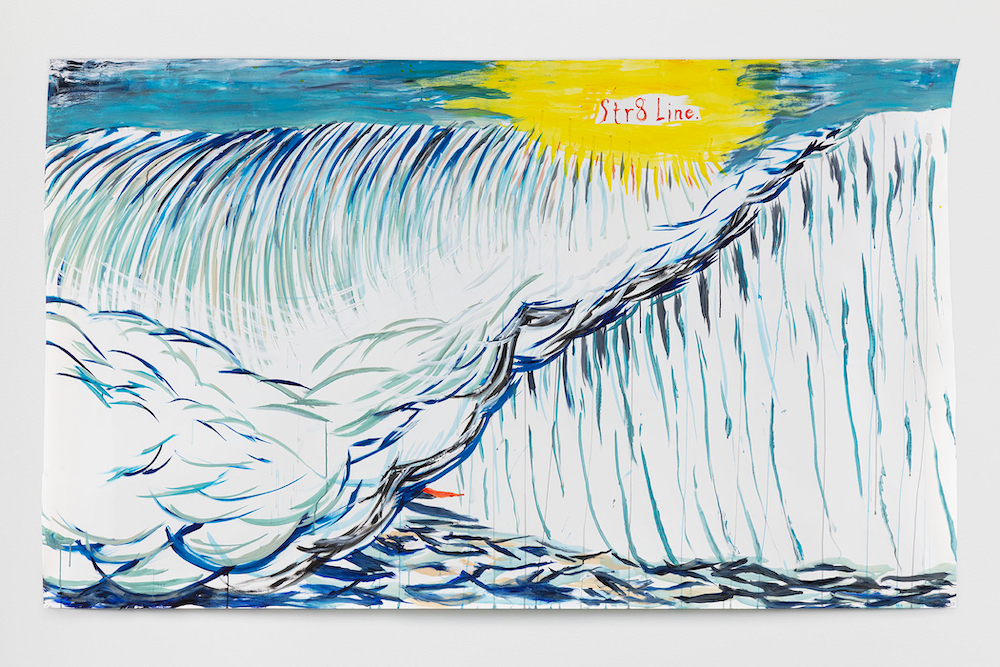
The thematic core of the installation was the ocean, with large drawings of waves anchoring neighboring clusters of smaller images. In them, rhythmic strokes of blue, green, brown, and chartreuse articulate the concave span of ocean waves as intersecting currents peak in height. The waves are about to engulf the small gray figure of a surfer in No Title (Making a wave); in No Title (Str8 Line) and No Title (The Clear-cut brow), all 2020, only the boards appear, rendered as crescent slivers of bright red and yellow peeking through. Pettibon invokes the ocean’s allegorical intensity, the drawings hinting at everything from looming climate catastrophe to the experience of image and info saturation in a world increasingly lived online.
Raymond Pettibon, No Title (Cancel the fake), 2019, ink, acrylic, and charcoal on paper, 22 1/2 by 30 inches; at Regen Projects.
Courtesy Regen Projects.
At once spontaneous and studied, Pettibon’s pen-and-ink compositions evoke the caricature of Honoré Daumier, the comics of R. Crumb, and the late 1970s and ’80s second-wave Los Angeles punk era with which he is commonly associated. In 1976, he designed the iconic four-bar logo for the hardcore band Black Flag, whose founding singer, Greg Ginn, is the artist’s brother. Pettibon has often parodied the logo, highlighting both its renown and the ennui that accompanied its mass culture absorption. In No title (2019), the uneven bars appear to “brand” (in strokes of black ink) the buttocks of a cropped seminude female figure whose butt cheek also boasts a five-pointed-star tattoo. No title (I hate that), 2020, features five solid black rectangles of varying heights, resembling a bar graph. Topped by Pettibon’s signature all-capital lettering, each one seems to wage a complaint. One says, “I hate the squares”; another, “I can’t tell you how much I hate the word ‘image.’” At far right: “This is going to be a blockbuster.” The drawing speaks, self-reflexively and frankly, of the repetition—and the boredom—that goes into building a lasting cultural brand.
“Sometimes it’s not what you are saying but how you say it that really matters,” Pettibon commented in a 2017 interview. “The language is on fire and you just spit it out.” Left unframed and affixed to the wall with thumbtacks, the works’ display heightened this sense of immediacy. But Pettibon, who now lives in New York, felt less present in this show than in previous presentations, for which he has often spent extended time inhabiting the exhibition space, placing works directly, and sometimes drawing directly on the wall. The resulting energy and messiness were missing from this show, but the apocalyptic tone could not have been more apt for the present day.


